Accessibility

At Merrell we believe in bring the joy of the outdoors to all.

Therefor our digital properties should conform to the WCAG 2.1 AA accessibility standards.

Read more at on WCAG 2.1 at Mozilla.org

In addition to WCAG 2.1 AA compliance we follow a few additional core usability rules the enhance the site experience for all users.

MRL 2 H21 NOVA2 ANTORA2 1244
Discover

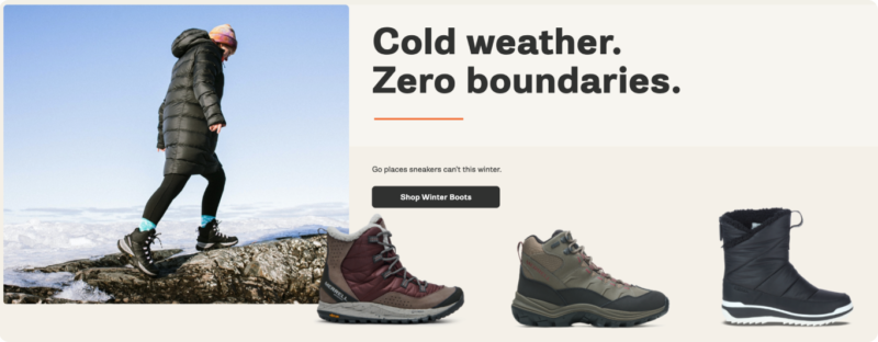
No type over photography

To enhance readability for all users of our digital products do not place type over top of brand imagery. While this is common practice in E-Commerce and Marketing we believe it leads to communications that are difficult to read and understand.

If an image is shot with this treatment in mind and can be executed with proper contrast it is acceptable.

  • Type do

    Use interesting compositions to compose the layout.

  • Moab on example

    Shoot the photograph with the type overlay treatment in mind.

  • Type over images Dont

    Drop an overlay or otherwise compromise the quality of a photograph to increase text contrast.

Type size & Contrast rules

Consider color contrast ratios when selecting background and type colors.

WCAG 2.0 level AA requires a contrast ratio of at least 4.5:1 for normal text and 3:1 for large text. WCAG 2.1 requires a contrast ratio of at least 3:1 for graphics and user interface components (such as form input borders). WCAG Level AAA requires a contrast ratio of at least 7:1 for normal text and 4.5:1 for large text.

Large text is defined as 14 point (typically 18.66px) and bold or larger, or 18 point (typically 24px) or larger.

Utilize this Contrast Checker tool to test color combinations.

  • Contrast slate sand

    Contrast Ratio = 10.54:1 👍🏽

  • Contrast white slate

    Contrast Ratio = 11.78:1 👍🏽

  • Contrast orange sand

    Contrast Ratio = 2.51:1 👎🏽

Using the Merrell Brand Orange

While orange is the primary brand color we use it sparingly for a few reasons.

Overusing the Merrell orange would deflate its impact.

Orange is almost never the right color for a piece of type or UI component. In our content design system it is only allowed as a type color in short eyebrow text.

  • Bad App is Bad 2
  • Bad App is Bad 1

Use orange tastefully as an accent – Orange Zest.

  • Homepage example
  • Email example
  • Homepage example 2

Respect prefers-reduced-motion in CSS

While fast and complex UI animations are fun and engaging for most users they may cause issues for others. This complex animations should be developed in a way which respects the CSS prefers-reduced-motion media query to gracefully degrade the animation for users who have enabled the reduced motion setting of their operating system.

Read more about prefers-reduced-motion.