Palette
Our features a warm, approachable cream as its hero color while honoring our heritage with subtle pops of orange. The UI color palette supports additional colors for functionality—please visit the Design Tokens page under UI Guidelines for details.
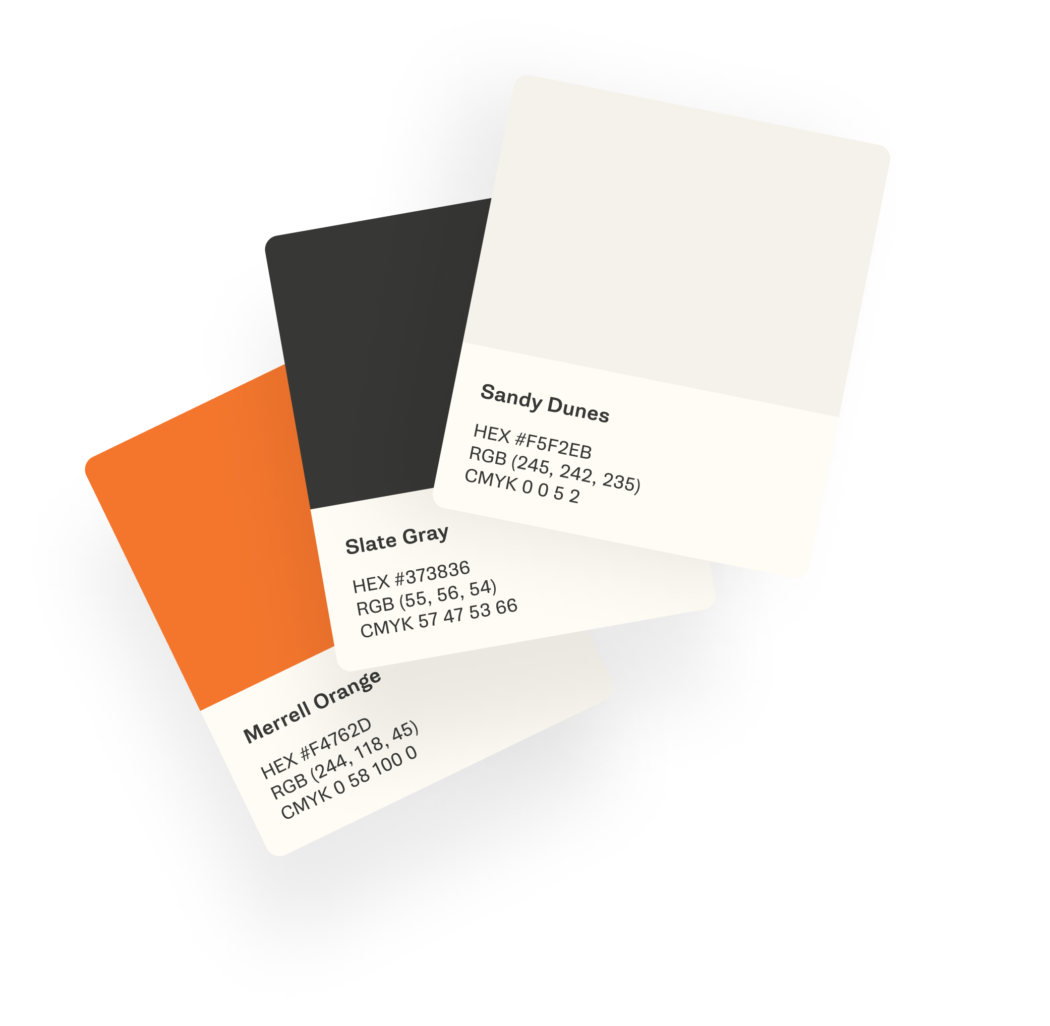
-
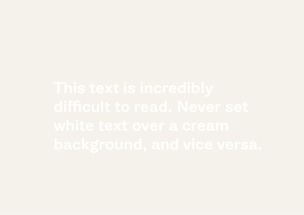
Sandy Dunes
#F5F2EB
RGB (rgb(245, 242, 235))
CMYK (0,0,5,2) -
Arctic White
#FFFFFF
RGB (rgb(255, 255, 255))
CMYK (0,0,0,0) -
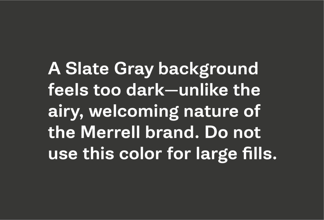
Slate Gray
#373836
RGB (rgb(55, 56, 54))
CMYK (57,47,53,66) -
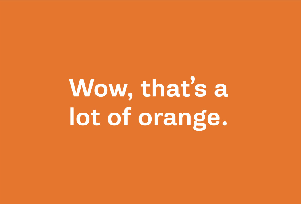
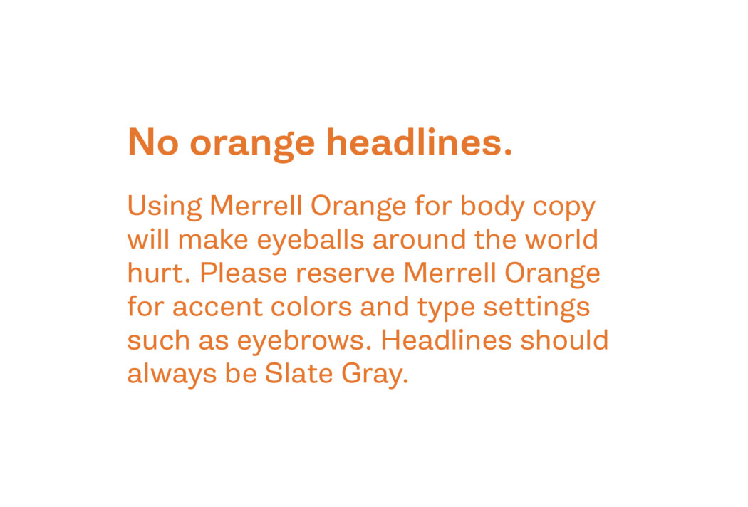
Merrell Orange
#F4762D
RGB (rgb(244, 118, 45))
CMYK (0,58,100,0)
PMS 3564 U