Design Tokens

Anything we see on a website is built from elements of style.

Design tokens are a limited set of discrete options, just like a scale of musical notes is drawn from the spectrum of all possible frequencies. Or like the presets on a car radio — not every option, just a specific selection.

Use of these definitions will reduce the design decisions you make while developing content for the Merrell brand and ensure consistency across our digital properties.

Elements final
Discover
Baseline example

Baseline Grid

A baseline grid is a series of invisible vertical units that can be used to create consistent vertical spacing with your typography and page elements. It is an invisible way of giving order to disorder.

By following the baseline grid you will naturally establish order and create a pleasing vertical rhythm in your layouts.

Use a 8px for baseline spacing – or 50% of the root font size.

Type Scale Graphic

Typographic Scale

Our type scale is based on a Perfect Fourth scale (1.333 or 4:3) and a base font size of 16px.

Adhering to the type scale and baseline grid will assure your compositions exhibit a visual pleasing typography scale.

Type Size Tokens

Some design professionals will tell you that Typography is 90% of web design, and we tend to agree. We’ve outlined a selection of headline styles that adhere to the aforementioned scale of 1.333 to assure all type naturally creates a beautiful vertical rhythm.

  • Headline 1

    [ ]

    @ px / px CS:

    We all belong outdoors.
  • Headline 2

    [ ]

    @ px / px CS:

    We all belong outdoors.
  • Headline 3

    [ ]

    @ px / px CS:

    We all belong outdoors.
  • Body Large

    [ ]

    @ px / px CS:

    We all belong outdoors.
  • Body Regular

    [ ]

    @ px / px CS:

    We all belong outdoors.
  • Body Small

    [ ]

    @ px / px CS:

    We all belong outdoors.
  • Eyebrow

    [ ]

    @ px / px CS:

    Eyebrow – Not the kind on your face
Border radius

Border Radius

$border-radius: 8px;

Cards and image containers should use an 8px border-radius.

When rounded containers or cards run into the edge of the viewport they should lose the border-radius to appear to bleed off the page.

Border radii should be mutated to accommodate another radius when they appear too closely to each other. The intent is to normalize the space between the two radii to make the width consistent, like a simple stroke.

Avoid more than two levels of rounded elements to keep visual simplicity.

Stoke brandsite

Line and Stroke widths

All lines and strokes should be 2px or equivalent unit in width. This ensures that Icons, horizontal rules, ornamentation, and any other stroke carries a consistent amount of weight.

It seems obvious. But using inconsistent stroke weights throughout a system of layout can very quickly bring a feeling of disorder.

UI State Colors

We’ve defined four state colors for use in digital components to reflect their validation state.

These colors should only be used on Form elements or other interface elements that need to visually communicate Success / Error / Warning to the user.

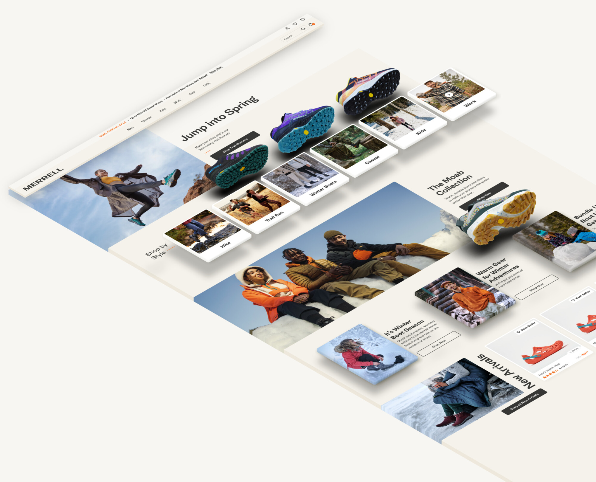
Site Iso

Elevation

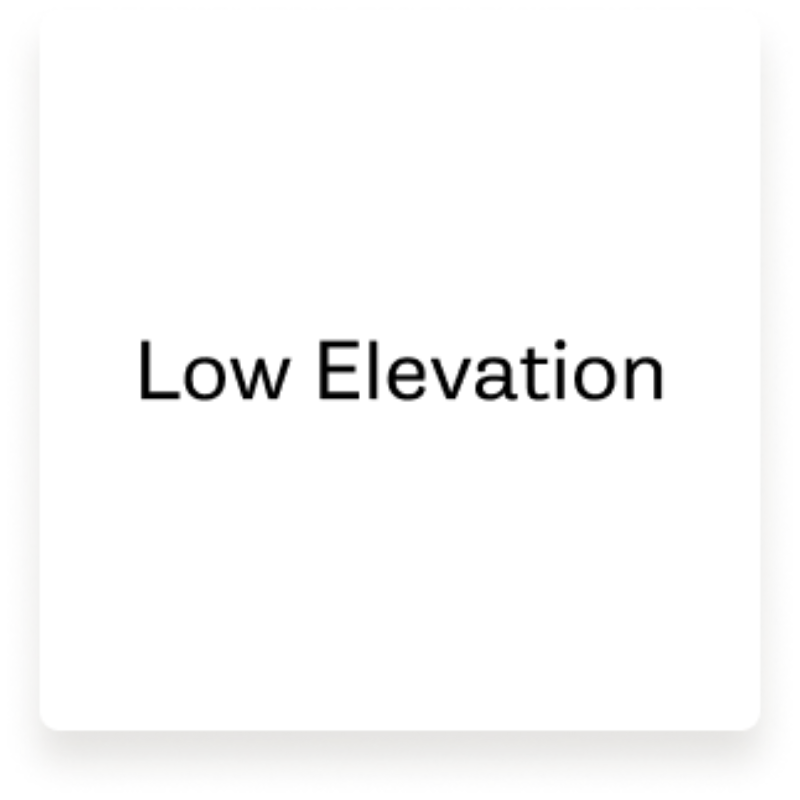
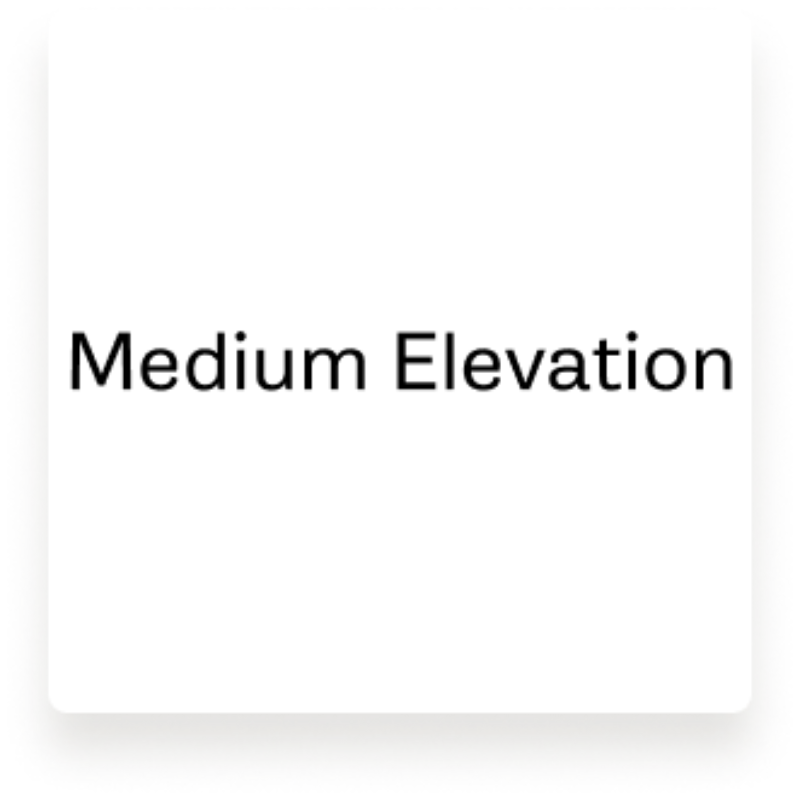
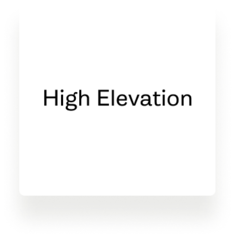
Use these defined shadow tokens to bring a sense of depth to UI elements.

  • Low elevation

    box-shadow: 0px 12px 16px rgba(54, 46, 27, 0.13);

  • Mid elevation

    box-shadow: 0px 20px 16px rgba(54, 46, 27, 0.12);

  • High elevation

    box-shadow: 0px 34px 29px rgba(54, 46, 27, 0.1);