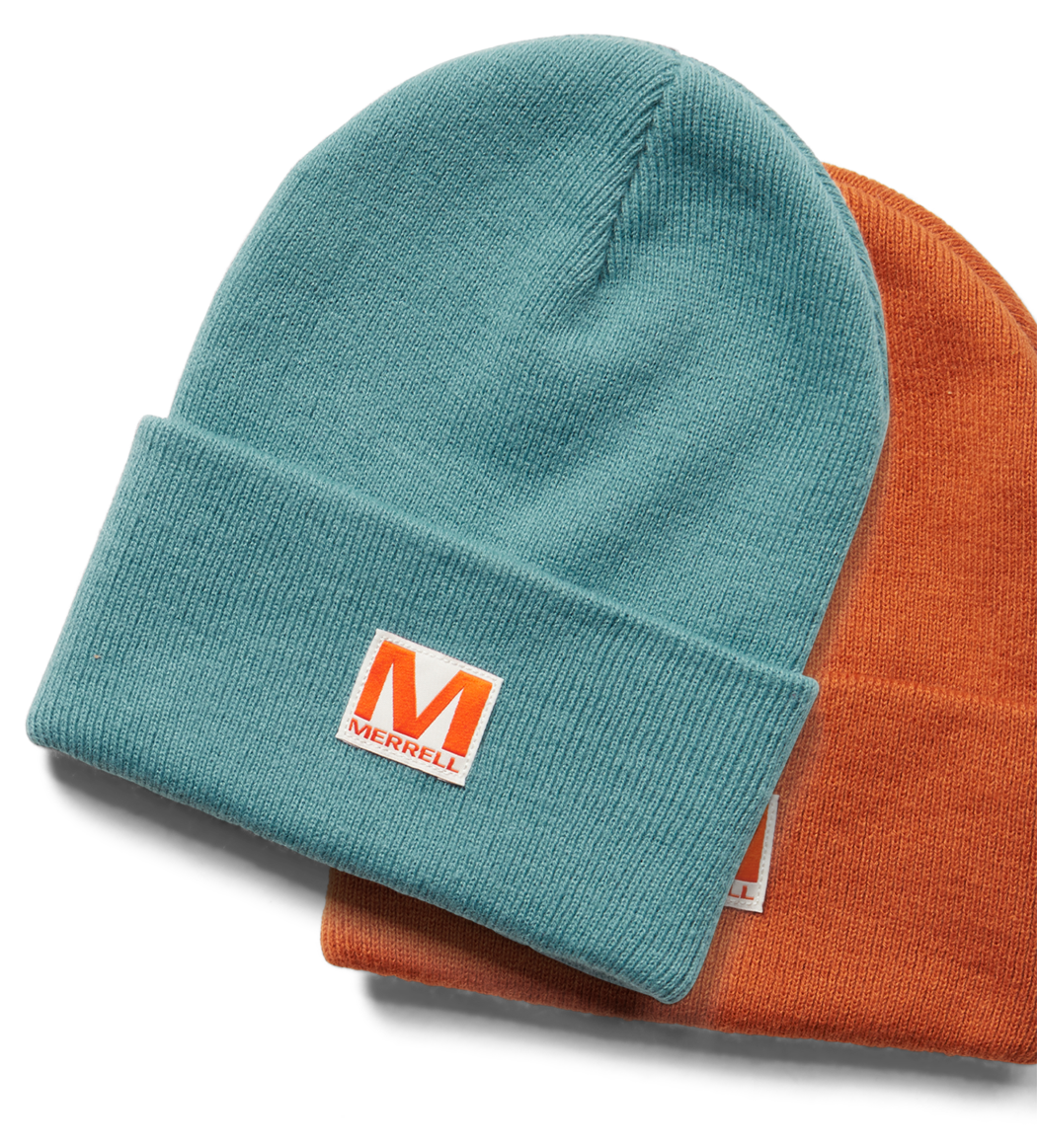
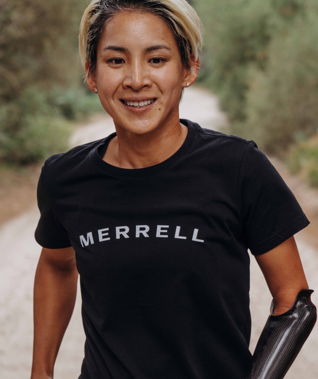
The logo should be treated as a graphic element in and of itself, and where possible, used as a key component of layouts. Please use only the primary logo in any media assets. We are only using the secondary logos for items such as app and social icons as well as for merchandise. Any other logos should be retired.
Logos
Our logo is the cornerstone of our visual identity. It boldly represents the Merrell brand and instantly communicates who we are in a way that is both modern and iconic.


In cases such as in-store packaging, you may need to include at least one instance of the Primary Logo with the registered trademark symbol. However, the assets contained in this style guide will not require it. When in doubt, please check with legal.
Usage
The Merrell logo should establish a strong presence wherever it is applied. Consider these important points when using the logo in any application. Careful use and adherence to the following guidelines will help maintain the integrity of the logo. It should not be altered in any way.
Logo Color
Primary colors for our logos are Slate Gray or Arctic White. Merrell Orange may be used in very limited instances when the logo might appear completely by itself, such as social icons. If you would like to use the orange version for a given scenario, please reach out to [email protected] for approval first. Refer to our color page for precise values and guidelines around background colors.
-

Slate Gray on Sandy Dunes
-
Slate Gray on Arctic White
-
Insufficient contrast.
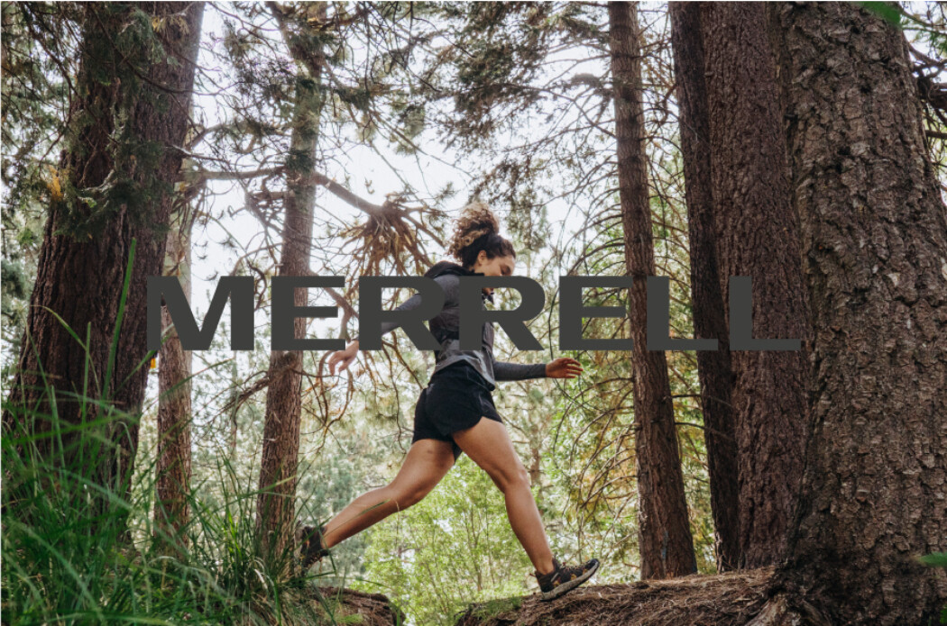
Usage on Photography
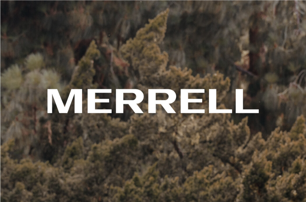
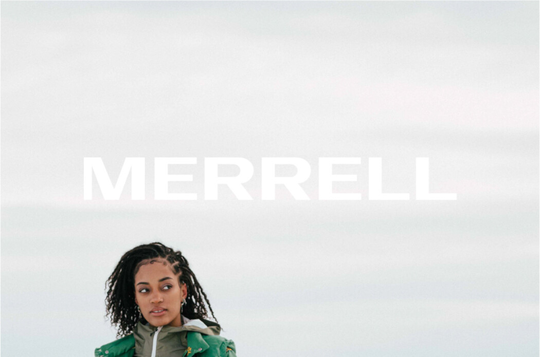
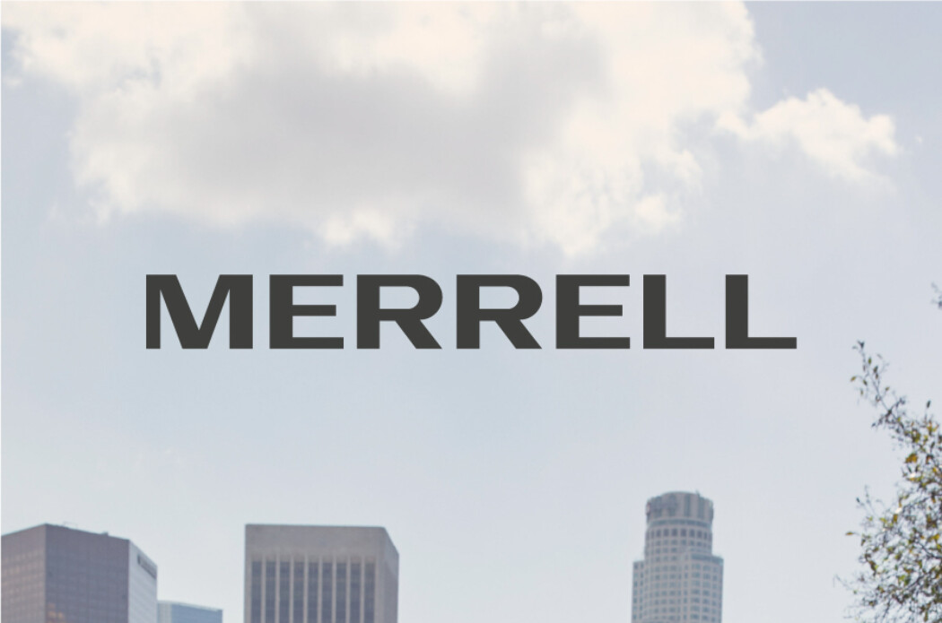
The logo should be placed on photography with careful consideration, ensuring that the image provides ample visual contrast. Please use the white version wherever possible. Avoid heavily patterned or highly textured imagery that will challenge the logo and inhibit its legibility and impact.
-

Do place the logo on backgrounds with ample contrast.
-
Do not place the logo on images with insufficient contrast.
-
Do place the logo on clear and simple backgrounds.
-
Do not place the logo on backgrounds that are busy or complex—and certainly not on top of someone's face.
Clear Space
The minimum clear space around the logo is equal to the height of the letter “M,” as shown. In most cases, no other elements should be placed within the clear space—this allows the logo to remain legible and balanced in all applications. However, our logo x product lockup is a key part of our identity and is the primary exception to this rule.
Maintaining clear space with the Merrell logo depends on the type of communication and use. In limited applications, the clear space may be reduced by half if absolutely necessary.
Improper Usage
We like our logo, so please do not alter it in any way. It should only be used in the appropriate colors from our color palette. Shown here are a few samples of what not to do. This list is not exhaustive, so please stick to the provided guidelines or just ask us if you have questions. Some rules are made to be broken, but not when it comes to our logo.
-

Do not distort the logo.
-

Do not alter the spacing between letters.
-

Do not introduce new elements.
-

Do not rearrange the logo.
-

Do not rotate the logo other than 90º CCW.
-

Do not rotate the logo to be read from top to bottom.
-

Do not apply effects to the logo.
-

Do not introduce new colors into the logo.
-

Do not type out the logo in a different font.