Typography

We’re keeping it simple with just one typeface: Gira Sans. It's a grotesque (in a good way) typeface full of intentional irregularity and visual character. We think it's a modern, human, and joyful take on the 19th century sans serif, and captures how we want our consumers to feel when they think about Merrell.

Type Header
Discover

Download

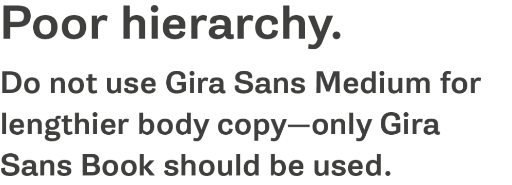
Gira Sans—and only Gira Sans—should be used in all instances where typography is required. Our email-safe font, Arial, is to be used for consumer-facing Merrell marketing emails only, in instances where a default email-safe font is absolutely necessary. See language support below.

If you do not have an Adobe Creative Cloud account and still need the fonts, please reach out to [email protected]

  • Gira Sans

    Book · Book Italic · Medium · Medium Italic Download

Aa
abcdefghijklmnopqrstuvwxyz ABCDEFGIJKLM NOPQRSTUVWXYZ 0123456789£$%&°/()!?.;,: AaBbCc 01234 Book Medium

Language support

  • Catalan
  • Croatian
  • Czech
  • Danish
  • Dutch
  • English
  • Filipino
  • Finnish
  • French
  • German
  • Hungarian
  • Indonesian
  • Italian
  • Malay
  • Maltese
  • Norwegian
  • Polish
  • Portuguese
  • Romanian
  • Slovak
  • Slovenian
  • Spanish
  • Swedish

Extended Language Support

Any English text should be in Gira Sans, but if you need language support for any languages not listed above, we have specified the alternate fonts that you may use instead. Please use only the styles specified for each typeface. Let us know of any concerns regarding these font selections.


If you do not see the language you need listed, please reach out to [email protected] to request a font specification.

  • Arabic

    Tajawal Medium · Bold Download
  • Bengali

    Noto Sans Bengali Regular · SemiBold Download
  • Chinese—Hong Kong

    Noto Sans HK Regular 400 · Bold 700 Download
  • Chinese—Simplified

    Noto Sans SC Regular 400 · Bold 700 Download
  • Chinese—Traditional

    Noto Sans TC Regular 400 · Bold 700 Download
  • Greek

    Noto Sans Regular · Italic · Bold · Bold Italic Download
  • Hebrew

    Noto Sans Hebrew Regular · SemiBold Download
  • Indian Scripts

    Mukta (support for Devanagari, Gujarati, Gurumukhi, and Tamil) Regular · SemiBold Download
  • Japanese

    Noto Sans JP Regular 400 · Bold 700 Download
  • Korean

    Noto Sans KR Regular 400 · Bold 700 Download
  • Mongolian

    Noto Sans Mongolian Regular Download
  • Russian

    PT Sans Regular 400 · Regular 400 Italic · Bold 700 · Bold 700 Italic Download
  • Thai

    Sarabun Regular · SemiBold Download

Type Hierarchy

We think it's important to give typography a sense of hierarchy in order to streamline communication and present information in a way that's easily digestible. Not everything can be big and bold and front and center all at once. Here are a few ways to establish type hierarchy that follow our brand guidelines:

  • Type Rule 1 2x
  • Type Rule 2 2x
  • Type Rule 3 2x
  • Type Rule 4 2x

Typography Guidelines

Case

We know by now that all-caps is the typographical equivalent of being screamed at. So please limit all-caps to no more than around 30 characters. WHICH IS ABOUT THIS MANY CHARACTERS. See? That's loud. So use very sparingly and with purpose. Consider reserving all-caps for items such as eyebrow text.

Pro Tip: Sentence case is always preferred for headlines and body copy. Title case can be used for proper titles and product names.

  • At Merrell, we believe in the simple power of being outside and we strive to be a dedicated steward of our environment. We exist to inspire everyone to explore the outdoors, and we need a healthy home in order to do just that.

  • At Merrell, we believe in the simple power of being outside and we strive to be a dedicated steward of our environment. We exist to inspire everyone to explore the outdoors, and we need a healthy home in order to do just that.

  • Do use sentence case for campaign headlines.

  • Do Not Use Title Case for Campaign Headlines.

Color

Use careful consideration (and some common sense) regarding colors and legibility. Please reserve Merrell Orange for use as an accent color only—it should feel subtle but intentional. Do not use Merrell Orange for headlines or body copy—in those cases, Slate Gray should be used. Hyperlinks should be underlined and set in Merrell Orange.

  • Color Good 2x
  • Color Bad 2x

Leading

Ensure that you provide the right amount of leading or line spacing for your copy—we want to give our content room to breathe. At the same time, too much or too little could make text difficult to read. It should never be too open or too tight—so aim for 'just right.’ Y'know, like Goldilocks.

  • Sharing the simple power of being outside with everyone.

  • Sharing the simple power of being outside with everyone.

  • There is something unmistakable in the joy of experiencing the power of being outside. There’s release. There’s freedom. It’s different than the ‘manufactured joy’ seen in so many stock photos. Let’s instead celebrate and illustrate the honest happiness people experience when they’re outdoors.

  • There is something unmistakable in the joy of experiencing the power of being outside. There’s release. There’s freedom. It’s different than the ‘manufactured joy’ seen in so many stock photos. Let’s instead celebrate and illustrate the honest happiness people experience when they’re outdoors.

Tracking

Extended tracking is reserved for all caps eyebrow text only. In all other cases, tracking should be set to zero to ensure legibility.

  • Type Rule 7 1 2x
  • Type Rule 8 2x
  • Type Rule 9 2x

Rags, Widows, and Orphans

A poor rag is distracting and makes lines of text much harder to read. Correct this by making manual line breaks to even out the ragged edges in the right margin.

  • Rag Good 2x
  • Rag Bad 2x

A widow is a very short line—usually one word—at the end of a paragraph or sentence that diminishes readability. It is both distracting and interrupts the reader’s eye. Fix them by adjusting line breaks or editing the copy itself.


An orphan is a word or two of copy that appears alone at the beginning of a column or a page. Please watch out for both orphans and widows and adjust these awkward breaks to improve upon reading quality.

  • Orphan Good 2x
  • Orphan Bad 2x

Comfortable Reading

The right amount of characters per line is key to the readability of your text. Be conscious of the line length for any copy—the optimal length is considered to be 50-60 characters per line. If a line of text is too long or too short, it can make reading a rather strenuous task.

Applications